Home› Journal› Neutral Nursery Color Palettes That Aren't Boring
Neutral Nursery Color Palettes That Aren't Boring
Five neutral nursery colour palettes with warmth and depth — gender-neutral, calm and anything but boring, built around natural wood.

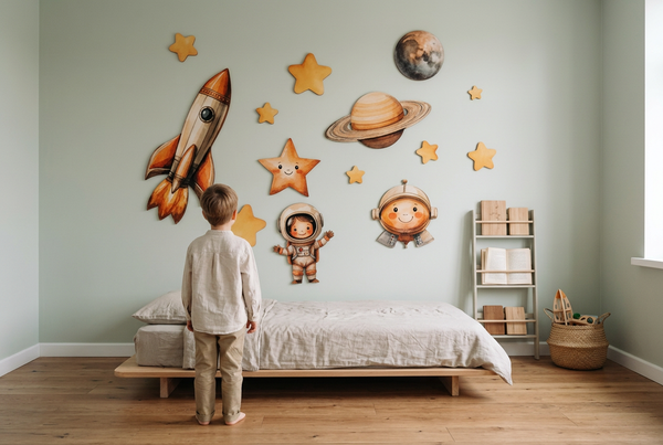
Neutral doesn't have to mean bland — the trick is warmth and texture. A neutral nursery feels calm and grows with the child, and with the right combination it's anything but boring. Here are five palettes that stay warm, plus how to bring them together.
1. Oat + sage + wood
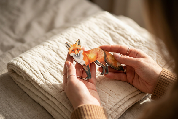
The easiest warm-neutral: creamy oat walls, soft sage accents, natural birch. Calm, fresh and effortlessly gender-neutral — perfect with a woodland scene.
2. Sand + clay + cream
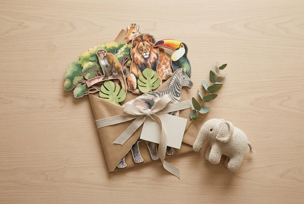
Warm desert tones — sandy beige, muted terracotta clay, soft cream. Cosy and grounded; lovely with safari.
3. Greige + muted blue
Warm greige with a whisper of dusty blue keeps things soft and gender-neutral without going cold. Pairs beautifully with ocean.
4. Blush + oat
Muted blush (not bright pink) with oat and wood reads gentle and grown-up — soft, not sugary.
5. Cream + moss + brown
Deeper and earthy — cream walls, muted moss, warm browns. Rich and calming, especially in a room with lots of wood.
How to make a neutral palette feel rich
Layer texture (linen, jute, wood) and add one natural focal point — a birch wall-art set brings warmth and pattern without a single loud colour. Texture is what keeps neutral from tipping into boring.
FAQ
What is the best neutral colour for a nursery?
Warm neutrals like oat and greige with natural wood — cosier than cool grey.
How do you make a neutral nursery not boring?
Layer natural textures and add one warm focal point like real wood wall art.
Warm up your palette: shop birch wall art.